Timely has a new coat of paint
![]()
Did you notice that Timely looks a little different today? Well you'd be right - we've given Timely a new coat of paint to spruce things up!

Last week we announced plans to give Timely a makeover. We also showed the direction we were heading and invited you to preview the changes to get some feedback.
We were delighted with the response – more than 100 people sign up for the preview and we received heaps of great feedback and suggestions. The techbots used this feedback to make the final tweaks and we proudly rolled out the makeover today.
Providing an enjoyable and beautiful scheduling experience is one of our core missions at Timely and hopefully you’ll agree the new design delivers on that.
Here’s a quick summary of what’s changed
- Changed the fonts and layout through most the app
- The top menu is smaller so there’s more room for the calendar and settings pages
- The calendar has been overhauled with lots of lovely new touches (e.g., timestamps, current day )
- Individual settings pages are now shown on full pages and broken up by sections rather than tabs
- The “Settings” menu is now called “Setup” and all pages are accessible from the top level
- For users trialling Timely, we’ve created a whole new wizard to guide them through initial set-up
- Tweaks for mobile devices such as iPads to include the new interface changes
- Lots of work done under the hood to improve performance, particularly around page loading
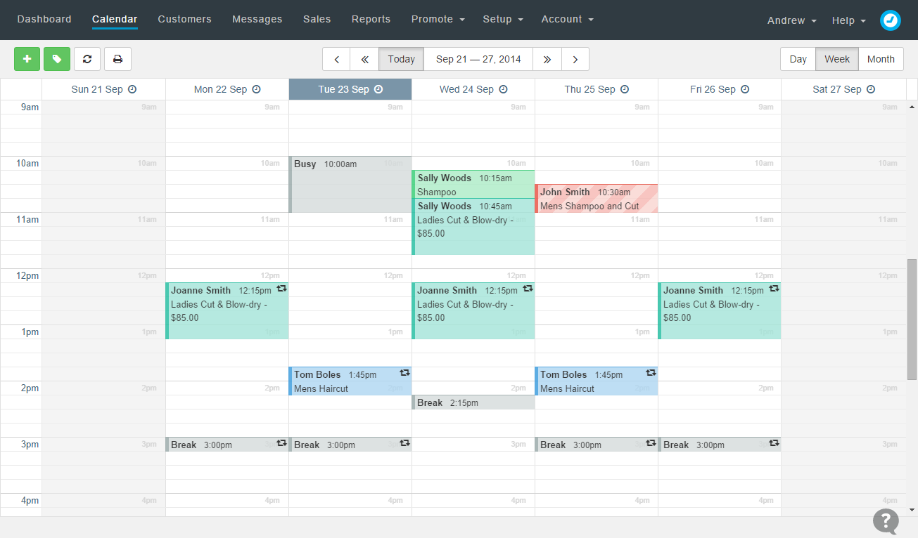
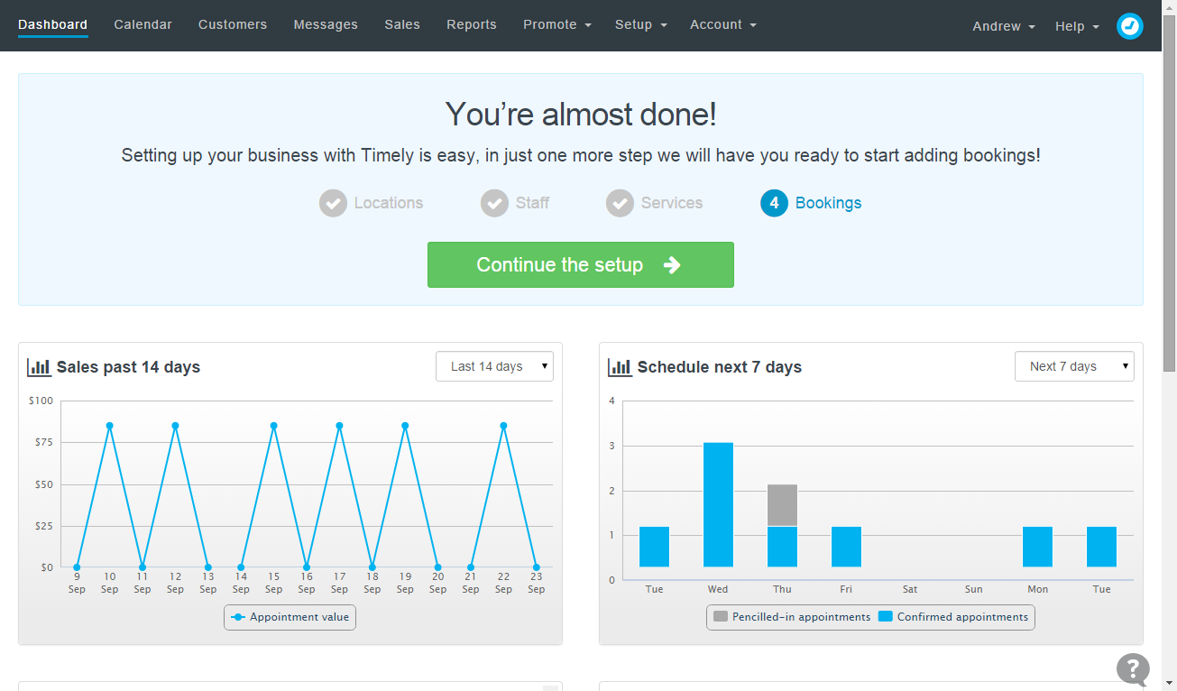
Want a couple of quick examples? Take a look at these — the first image shows how the calendar looks, including the new timestamps and the second shows off the dashboard and the set up wizard:
Go have a play to see what else you can discover. If you’d like to share any thoughts about the makeover, then please let us know in the comments below!


Dislike the sliding screen when inputting information for a booking, this makes data entry slow and clumsy.
Thanks for the feedback Terry! I'm not sure what you mean so feel free to send a little more detail to [email protected] and we'll take a closer look for you.
Great work! Thanks for all you do!
Am loving the new search function in the product screen, makes it so much easier to adjust stock levels etc without having to spend a lot of time searching for the right Product. Well done Timely
Good to hear! Will pass that on to the team.
Hello Andrew,
I sent you a screen shot concerning Terry Chandler's comment. I feel the same. ;(
Looks great, would be really useful to have for recurring appointment to repeat until further notice (eg not limited to date or 50 bookings.
Thank you
Hi Aimee, thanks for the feedback. The good news is that last week we added a new "never" expire option for recurring appointments. Go take a look :)
I think the new look is working well in fact I think it's better than the last one. I still think we need an app for iPads and iPhones for timely be so much easier when having a lot of staff like myself
Glad you like the changes. The mobile views were adjusted accordingly too. As for mobile apps, these are coming! Make to vote on this feature request to stay in the loop.
Techbot you're looking good. Font change great, looks more expensive :), timestamp very simple idea, but helpful.
Regards
Oliver
www.thecabin-ventnor.co.uk
Glad you like the makeover Oliver!
Love the new look, i still wish there was a place to enter the tip amount!
Great job besides that :)
Terry Chandler says:
September 23, 2014 at 8:53 am
Dislike the sliding screen when inputting information for a booking, this makes data entry slow and clumsy.
Andrew Long says:
September 23, 2014 at 9:07 am
Thanks for the feedback Terry! I’m not sure what you mean so feel free to send a little more detail to [email protected] and we’ll take a closer look for you.
What she is commenting on is the box that comes up when entering new appt.
It is improperly sized (and needs? a slider bar at bottom), also the text is not
formatted properly in that box.
Thank you the changes, seems better, and sorry to be bearer of bad news. ; )
rory
Thanks Rory. We're still trying to work out why this is happening, but if you log out and log back in it fixes it.