Good salon website design can quickly get very expensive, but in most circumstances, the cost comes from a lack of planning.
One or two hours of planning can leave you knowing exactly what you need to organise, how long it will take, and roughly how much it will cost. Unfortunately, we can’t give you the secret to a good and successful salon website because there isn’t one single thing that magically makes it great.
There are several aspects of your web design that need to work in unison to take your salon website design from ok, to great, to amazing. Have a think or take notes about the areas below before approaching a web developer, and you’ll save time, money, and be on the front foot before your salon website is even built.
Purpose + objectives
Your website is your most powerful marketing tool, and purpose is everything when it comes to marketing on a budget. There has to be a reason for doing what you’re doing, or you’re going to be washing your valuable marketing dollars down the drain.
As a tool in your marketing arsenal, your website should have a purpose too. Here’s an example of how salon website design could have its purpose defined:
“To sell salon products and services online.”
Now we can set objectives:
- Attract visitors to the website who may want to buy products and services.
- Attract visitors to the website who may know someone who wants to buy products and services.
- Communicate our luxurious salon brand to potential customers.
- Encourage customers to book online to free up admin time.
- Provide directions and contact information to potential customers.
- Capture client information for marketing purposes.
- Take this to a designer, and it’ll tell them what you need. If they can’t deliver solutions for your objectives, you may need to keep shopping around.
Best practice salon website design
There are a range of factors that make up a good website, like imagery, emotive copy, call to action buttons, and so on, and design is just another one of those.
You can greatly increase the effectiveness of a website by designing it well. Within the domain of design, there are a range of factors that can make a website fulfil its purpose better and represent your brand at the same time.
Colour palette
The colour palette is one of the more fun parts of good salon website design. There’s a plethora of information on the psychology of colour that’s just fascinating. It is said that McDonalds and Pizza Hut use red in their logos to stimulate hunger. Take that with a grain of salt (or side of ketchup), as you don’t want to make the mistake of thinking that colors alone can influence people. Only when they’re used as part of a multi-faceted strategy can the use of colour translate into results.
Colours don’t spark a conscious decision in consumers – it’s unlikely that people will say, “This designer used blue. Therefore he is trustworthy, and I will happily give him my dollars in return for a massage.” It’s a subconscious effect that, along with other factors, can help increase conversion.
For a guide to help you in choosing your brand colours, click here.
There’s a wonderful free tool called Palleton that allows you to pick coordinated colour palettes, or have one randomly generate one for you.
Tool: Paletton (FREE)
Layout
There’s a lot you’ll find online about the best website layout for conversion. There are obscure references like, “Make it an F shape, or a Z. Make it an L shape at 180 degrees.”
While these may work for some people in some industries on some websites, they aren’t rules that need to be followed.
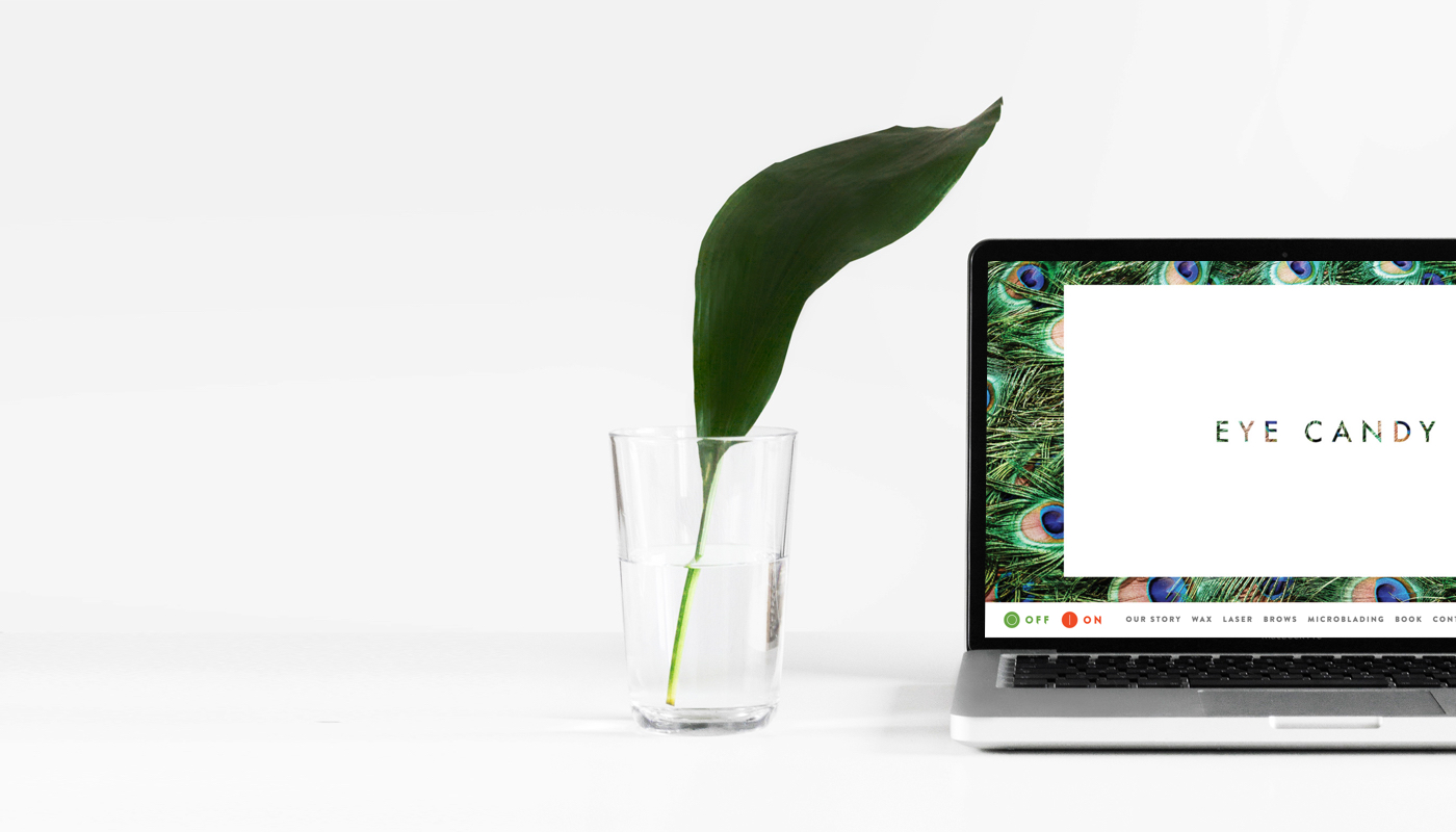
Look at the Timely website. Do you see any F shapes or L’s at 180 degrees? We simply lay out the information in order of importance to the customer, and place multiple call to action buttons on each section for people to find out more information.
Don’t get too hung up on the shape of your layout, because everyone is different and everyone has different content. Just arrange what you have in a logical fashion that guides the reader on a path towards your call to action, and presents them with information in an order they will find most useful.
If you’re creating a full width website (good on you!) this is easier if you break it into sections, and you can use each section to address a specific topic or USP (unique selling point) of your business.
Typography
A website’s typography can really add to the look and feel you’re aiming for in your salon website design.
For example, look at this same sentence below, but with two different fonts. The differences are minuscule, but they feel totally different.
Special Elite
The quick brown fox jumped over the lazy dog.
Garamond
The quick brown fox jumped over the lazy dog.
You can completely change the feel of your salon website design by changing the typography and nothing else. That includes line-height and kerning – all things that can be done easily.
You can completely change the feel of your website by changing the typography and nothing else. That includes line-height and kerning – all things that can be done easily.
When picking your fonts, you have hundreds of options to choose from with Google Fonts. Type in a word or phrase that you’d use, and then see how it looks on over 667 font families.
When you’ve found one you like, send it to your designer or follow the steps on the page to import the font into your salon website design.
Tool: Google Fonts (FREE)
Balance text and images
Images speak a thousand words. On most pages of a good website, the rule of thumb is to only use 2-3 sentences per section, and to allow your graphics, design, and imagery do the rest of the talking.
Incorporate this into your salon website design, and it’ll save you both time and money when it’s time to write copy. There is more on this in section 5 of this article, but it’s worth mentioning it in the design section.
Mobile devices
If your website designer doesn’t design for mobile and tablet, tell them to pack their things and go home. You’ll be missing out on enormous opportunities if you’re not giving mobile searchers a customised version of your website that makes it easy for them to use. Most website browsing these days happens on mobile, and Google rewards websites that are designed with this in mind.
Don’t just take your desktop website and squeeze it down into mobile size. Give your mobile browsers a customised experience that’s made for mobile, because they’ll be able to tell if you have. You should be able to convert customers just as well, if not better, on mobile than on desktop.
Community
A website is a good place to bring your community together from all corners of the web. That’s why people put social buttons and email signup forms on their websites. As the digital world has evolved, browsers of the interwebs have come to expect that a company’s website will serve as a hub for their communities located elsewhere. Make sure you’re meeting their expectations…no pressure.
You don’t need to be experienced in design to add awesome buttons to your salon website design. Check out these embeddable ones from Dream Template which you can add with a simple copy and paste.
Tool: Embeddable Social Icons (FREE)
Navigation
Good website navigation is far more important than most people think. A lot of times, navigation is what makes or breaks a site. A beautiful header with easy to read titles makes you feel comfortable with the website, whereas any navigation bar that makes you have to think about how to use it is jarring. You look at it and feel what can only be described as “ugh.”
A good rule of thumb for navigation bars is to have 5 main navigation titles. For most websites, this will be enough. For example, you may have:
- Home
- Services
- About Us
- Book Now
- Contact
You could put any other sub-menu items under your 5 main points. or example, you could list your services as sub-menu items under the “Services” tab so viewers are able to navigate to them from anywhere on your site.
Multimedia
Don’t do all your talking with words. You know the saying – a picture is worth a thousand words. With this in mind, pick your media carefully during your salon website design!
Images
Avoid stock photography if you can. Stock photography are images that you purchase or get free online, and anybody else is free to also purchase the same images. If you decide to use stock photography, you do run the risk of losing your individuality and not coming across as genuine – just a warning!
Illustrations are a great way to add something unique to your website if you don’t want to use images. Many of the stock photography sites have an illustration section where you can find something more unique and download them cheaply.
Otherwise, plan out a list of photos that you want for your website and take it to a junior photographer, take them yourself, or pay for a professional photographer to do it. If you do the planning and legwork before having to hire someone, you’ll be paying far less.
Video
Use videos that are 30-90 seconds long to introduce your website, explain your services, or feature customer testimonials. Keep these somewhere on your website, and make sure to share links on your social networks as well.
Check out our tips on making great videos.
Infographics
Infographics are images embedded with easy-to-consume information in the form of charts and diagrams that can communicate 1200 words worth of information in a single memorable image. Use your discretion when deciding if an infographic is necessary.
Don’t overdo it – your salon website isn’t Pinterest!
There’s a wonderful free online tool called Infogr.am that you can use to create infographics by simply dragging and dropping elements onto a canvas. We highly recommend it!
Tool: Infogr.am (FREE)
Content
Content is important. The creation of a salon website is a singular activity. It’s like buying a property (a domain) and building a business on it (a website). Now you can either let that property sit and dilapidate, or you can use it to constantly create products (content).
Content can be compared to products because content is consumable. It keeps your audience interested in you. It allows your reach to expand on the internet by creating a piece of your website that people want to share with their friends. And it keeps search engines happy.
If you’ve gone through the trouble of making a website, you should add a blog to it. Post once or twice a week. If you’re looking for content ideas, here’s something a small business owner in the accounting industry once said:
“It’s usually not worth my time to create blog posts from scratch. What I do try to do on the blog is answer many of the questions the clients ask me. The questions are usually about taxes or payroll. What I’ve noticed is that, if they’re asking me those questions, other people are asking Google, and I’m now ranking very high on search engines for a lot of these questions. They get a lot of shares too, because everyone knows someone with an accounting question.
These articles get me both traffic and sales, but I do think that the blog posts that answer questions have a higher conversion rate than other ones because I’ve already done something for these readers. They know I’m knowledgeable and they don’t seem to want to go elsewhere after one of their questions has been answered and simplified.”
Use your experience to your advantage!
Read our introduction to Search Engine Optimisation.
Copy
In a similar category to content is web copy. If content is a way of communicating to people, copy is like short form content, with an agenda. Copy presents information, communicates marketing messages, and influences people to make a decision or purchase.
When you’re writing copy for your website, try to keep it short. 1-3 sentences per screen is sufficient. Use all of the other tools in your arsenal to communicate whatever else you need to.
When you’re writing copy this short, you’ll want to choose your words wisely. Use emotive language to shape a reader’s perception of your brand as they scroll down the page. Bring up Thesaurus.com and use it!

Calls to action
Last but most certainly not least are calls to action. This is marketing speak for an instruction to the viewer to complete an action – literally a call to action! This can be anything from “Call Now” or “Book Now,” to “Sign up to our health advice email list.”
There are a few things to consider when you’re creating your calls to action in your salon website design.
- There should be at least one call to action every 1.5 screen’s worth.
- They need to be emotive – but not zany. You don’t want to be spammy
- They should be about 2-4 words (there are exceptions! The above example has 7!)
- They should be placed on a contrasting colour, or designed to stand out. This can also be achieved by using whitespace and borders
- They must be tracked.
Your call to action is the closest thing to the purpose of your website. It’s the piece of the puzzle that turns viewers into customers. The rest of the website should be designed to educate the reader, influence their emotions, and give them the information they need to make their purchase decision. Follow this process to ultimately lead them to becoming a paying customer.
Salon website design summarised
Your salon website design serves an important marketing purpose. It’s not just there to look pretty. If it doesn’t have a purpose, it’s not useful.
- Only when you know your website’s purpose can you start picking a colour palette, a layout, images, and typefaces.
- All of these things support your goals and objectives for the website.
- Don’t fill your website with words. Use images and illustrations to do some of the talking for you.
- Everything should be designed to lead a customer to take your desired action, which will result in website traffic becoming paying customers.