The great Timely report overhaul
![]()
Reports are essential for monitoring business health. In fact, reports are so essential, we made overhauling them our number 1 priority!

After a massive amount of development work in consultation with our expert business users, we’re ready to roll out the first report overhaul since … well … forever.
So, what’s been done?
Here’s a quick summary in one short(ish) list:
- Improved performance so reports run faster with no time outs
- Changed the layout and formatting of all reports
- Added 7 new reports
- Incorporated new information into existing reports
- Added more filters to control what information is presented
- Made it easier to print and export reports
- Added date selection presets (common date periods)
- Global settings for booking status selection
- Even more stuff!
New reports for business performance and appointment control
Let’s begin with an overview of the seven new reports, that’s right SEVEN. These are designed to more accurately measure business performance, financials and appointment reconciliation.
These are the:
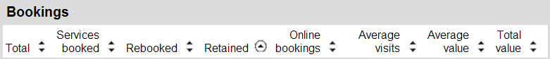
- Executive summary: Appointments and sales grouped by staff and location. Shows key performance metrics such as average visit period, rebooking and retention rates.
- Monthly summary: Similar to Executive summary but shows appointment data and sales across months so you compare month-on-month growth.
- Service sales report: Total sales value for your bookings grouped by category. Includes tax totals and category splits.
- Products sales report: Total sales value for products sold. Includes stock levels, tax totals and splits by product type.
- Incomplete Appointments: Shows appointments that have not been marked as completed (useful for end of the day).
- No-Show Appointments: Shows a list of appointments where the customer did not show. Includes a count of the number of times the customer has failed to show.
- Pencilled-In Appointments: Shows appointments still in pencilled-in status.
The first four reports are your go to reports for business health and performance — particularly the Executive summary. The Executive summary replaces the now defunct Business summary report and is superior in every way (well we think so!).
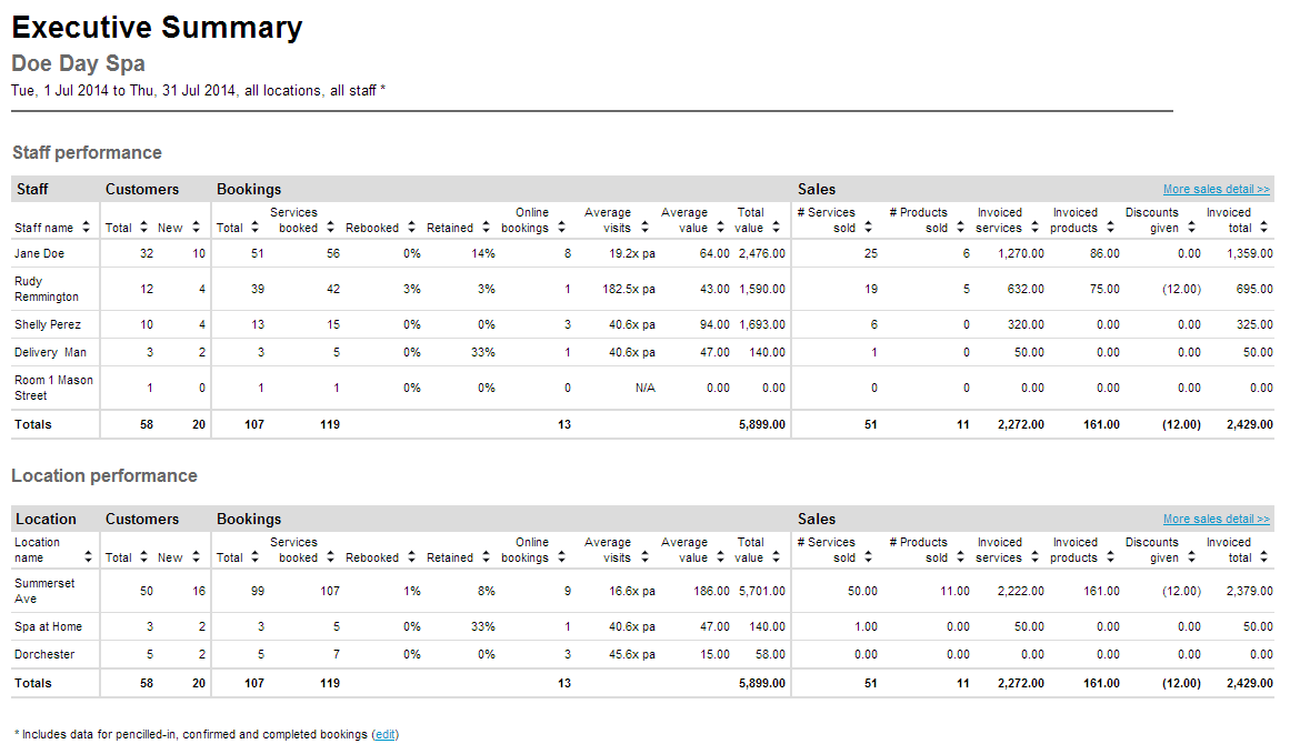
You can see from the Executive summary example above just how comprehensive it is. All data now comes from invoiced sales and extra information such as retention rate, average visits, average value, product sales, discounts applied and more is included.
You’ve seen the Executive summary, here are the other three key reports:
[slideshow_deploy id=’38421′]
These four plus the additional three appointment related reports will make a huge difference for monitoring overall business health and performance.
What do you think? Let us know in the comments.
Changes to the Report tab and interface
We’ve tweaked the interface too so head over to the Reports tab to see the new additions. Let’s start by selecting a report such as … I don’t know … the brand new Executive Summary and check out the report action menu.
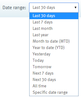
The Date range selector now has a whole lot of common date periods or presets to choose from (see image below). Click the drop-down arrow, select a preset and then view your report.
Next up, look to the right of the report header to see a new Settings link.

Clicking this will pop up a box that allows you to set which appointment statuses should be included in reports that summarise appointment data.
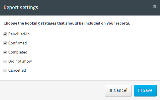
For example, some businesses may wish to include “Did not show” appointments in their reporting, whereas others may not. Regardless it’s super easy to make your selection and this selection will show in the report footer.
Printing, exporting and navigating through reports has been, to be fair, a little cumbersome. Because of this we scrapped the existing options and came up with something a lot clearer and more in keeping with Timely.
Here’s what the new print, export and navigation menu looks like:

Very simple to understand and fast to use!
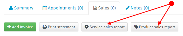
We also added a couple buttons to the Sales tab of individual customers. When clicked, these will run the Service sales and Product sales reports, respectively.
Finally, many of the reports can be resorted on the fly. What this means is that if you want information to be presented in a different order, simply click the small black arrows next to the column header and the report will update automatically.
The reports layout and formatting
The next step was to redo how the reports looked and unify this presentation across all existing reports. If we take a look at the example below (Executive summary again!) we can see there is new header that shows the report name, the business name, the date range selected and which locations and staff are included.
The body of the report has been totally rejigged. All columns, alignments and lines have been changed to a more elegant and easier to read presentation. In addition, all dates and dollar amounts (particularly 4 digit and larger) are now consistent across all reports.
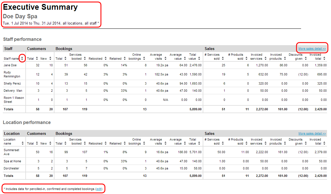
In the example above you can see what the appointment status note looks like once your global appointment statuses are set. You may have also noticed the link to More sales detail >> which drill down to specific reports when clicked. In fact, other reports have links too, that point to specific customers and invoices.
And if your report is large but doesn’t require pagination, it will now display the whole report on one screen. But if a report does go to multiple pages then the column headers will appear on each page so that the information still makes sense.
Finally, exporting and printing reports has also been looked at. Exporting to Excel has been improved so that columns and layout works beautifully. And when printing reports, a page number is now included at the bottom – just like this:
 Phew!
Phew!
Other miscellaneous changes
I thought I was done but there are EVEN more changes so here’s a quick summary of these (last ones I promise!):
- The Customers absent report as been renamed to Customer retention.
- Location and staff dropdowns added to all applicable reports.
- Added a summary of cancellation reasons to the Cancelled Appointments report
- Added sales data to Customer Spend report
Work in progress
I know there are lot of changes to grasp already and the post is long already but here’s a few other report enhancements just over the horizon:
- Add the ability to attribute individual sales items to staff members on invoices.
- Add new reports to improve the visibility of staff performance such as staff commissions and other key staff metrics.
- Add a “Live” dashboard displaying key business stats on the reporting page itself.
All of these will make reporting even more amazing so make sure to click the links (above) to leave your vote. Also, check out the roadmap to see what other enhancements are on the way too.
I mentioned at the start of this post just how critical good reporting is to the health of a business. We sincerely believe this and consequently the raft of changes outlined in this post show just how serious we are.
Now, go have a play and let us know what you think!


Wow this is awesome!!!!!!!!!!!!!!
I just wish there was a simple click (checkbox) to include or exclude items from certain reports...
For instance daysheet - it stills hows price and phone number and I'd like to include or exclude those without having to download word doc then edit and print.
Thank you
Anita, glad you love the reports! Let us know if they need anything else. As for the customisable day sheet, that is on the list!
I have three suggestions to add to the new report functions. Like Anita I do think the improvements are awesome! You all deserve a might congrats!
1. I'd like to see a "Current Month" selection on the quick picker, MTD is awesome but there are some information I'd like to pull of for the whole current month.
2. I noticed you added totals to the Staff Appointment Summary Report per staff member, It would be amazing if you could make a report that just gave the value totals for the given period by service status.
3. Add the ability to download the information in a raw un formatted excel/csv file so that we can manipulate the data easier with programs. The timely reports are very pretty, but un-formatting it all the time gets boring. I want to automate things I do on excel with timely/vend data and this would be the golden goose.
Thanks again for all the amazing work Timely!
Sam
Things I'd find useful
1. A Report that collates the information from the "source" field (client more info tab) to track where business is coming from.
2. Text and email alerts to multiple staff members for the same job, for example a 2 man removals team.
Great work guys